INTRODUCTION
Yuvaekta was struggling to create an impactful online presence to their cause. We worked closely with this passionate organisation to develop a powerful UX with a blend of elegant UI.
THE PROBLEM
Yuvaekta was a non-profitable trust which envisions a society where every individual has dignity, self-worth and is empowered to express, irrespective of any barriers and stereotypes. Their website needed to visually construct a feeling of belonging to a safe society. The user experience needed to be engaging and natural, enabled by communication design in the form of vivid colors and poetic content.
THE SOLUTION
We started with understanding the vision, mission, values, and the change they wanted to bring to the country. A complete walk through inside the Yuvaekta team made it possible to learn their perspective from the core. We distinguished their programs, projects, agenda and other campaigns with unique colors and sections for a better experience. The website was redesigned to be user-friendly and engaging.
COLORS AND TYPEFACE
Colors were chosen in such a way that each color symbolizes a distinct program. The primary colors were taken from the logo to keep their identity alive.


HOMEPAGE HIGHLIGHTS
The home page needed to cover all the aspects of their NGO ranging from their causes, various programs, camapign highlights, ongoing and upcoming events.


ABOUT US PAGE
Yuvaekta needed to describe their enormous field of work. We organized their various programs clearly to show their work. A trust factor is developed by giving a complete walk through deep inside the organization.


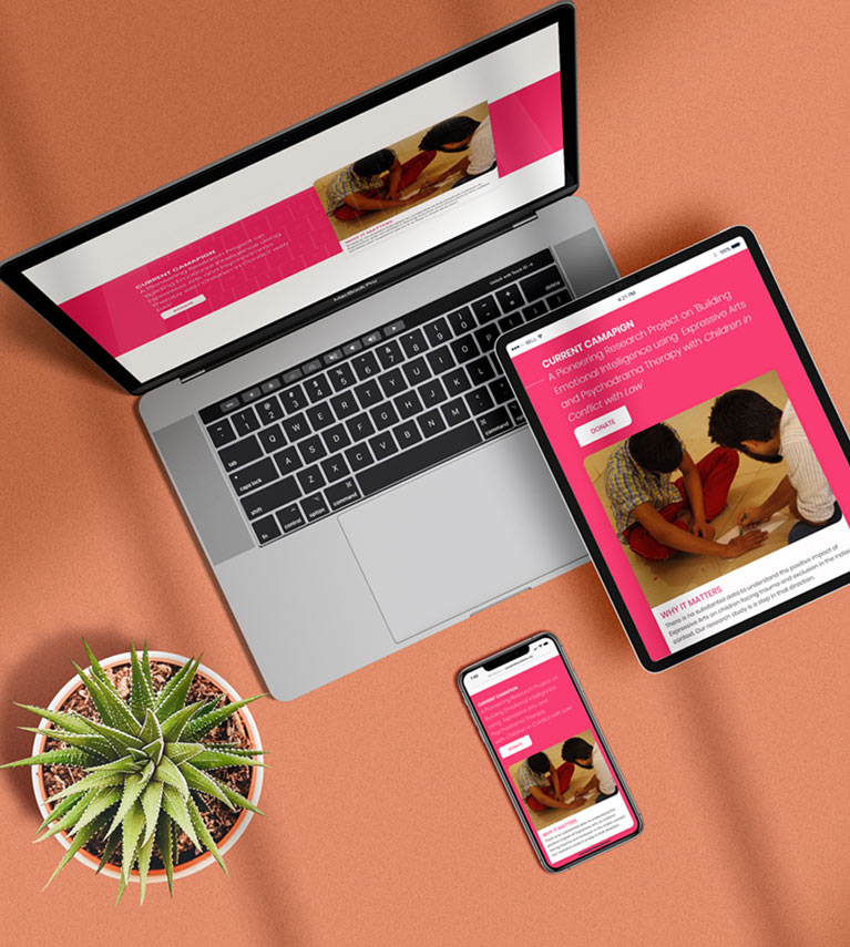
RESPONSIVE DESIGN
The user interface is designed responsive in such a way that it can easily be accessed on multiple devices with ease.


At Mush, we even designed a seamless color palette that would merge well and elevate the experience with their brand identity.


